
As part of today’s event, Intel unveiled a new logo and branding for the first time since 2006 (1969 was the branding change before that.) One can see some of the new branding elements with Karen Walker SVP and CMO at Intel showing off the new logo.
As part of the change, Intel is also refreshing its portfolio of brands to align with the new corporate branding.
New Intel Logo and new Intel Xeon Branding
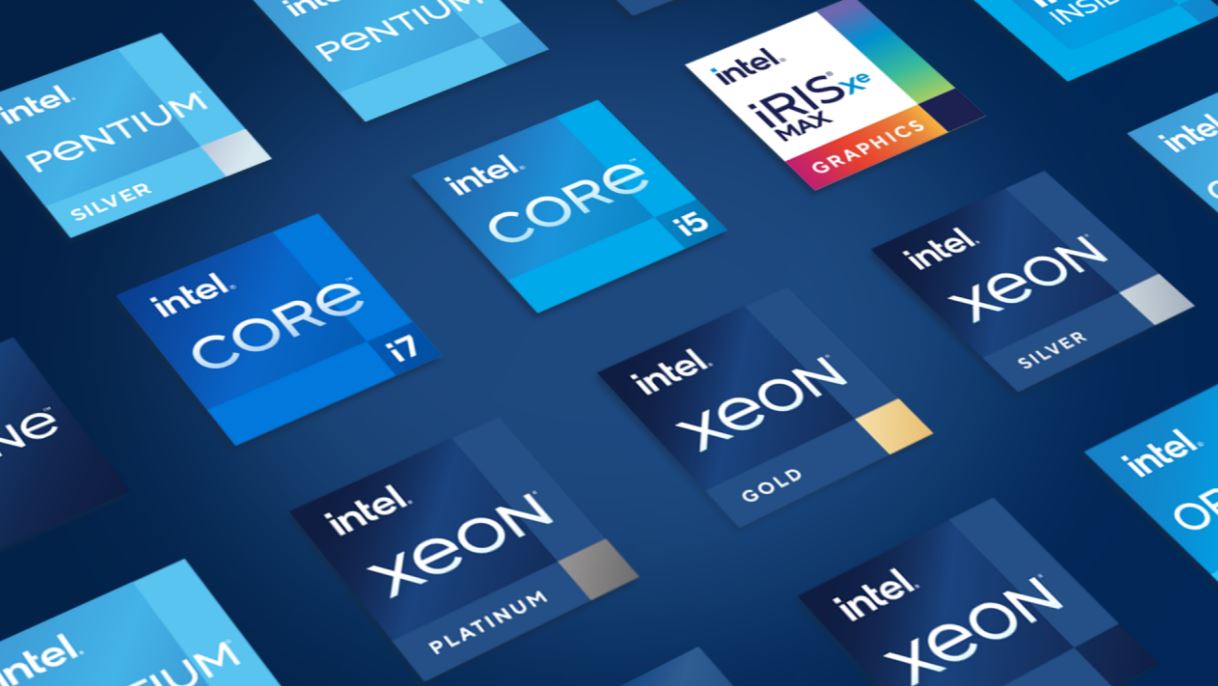
Here is a quick look at the transitions for the Intel logo and a timeline. This is the first major change in the brand in fourteen years. We are going to dub this, the 3rd Generation Intel Logo, since we are now in the era of the 3rd Generation Intel Xeon Scalable.
With the 3rd Generation Intel Logo, Intel now has a lower-case branding and new typography that features a block design and a softer color pallet.
To align with this new branding, Intel is refreshing its portfolio. One can see that the new Core, Intel Evo (for mobile with Project Athena enhancements), and Iris Xe marks were updated to coincide with the simulcast 11th Gen Intel Core Tiger Lake 10nm Launch.
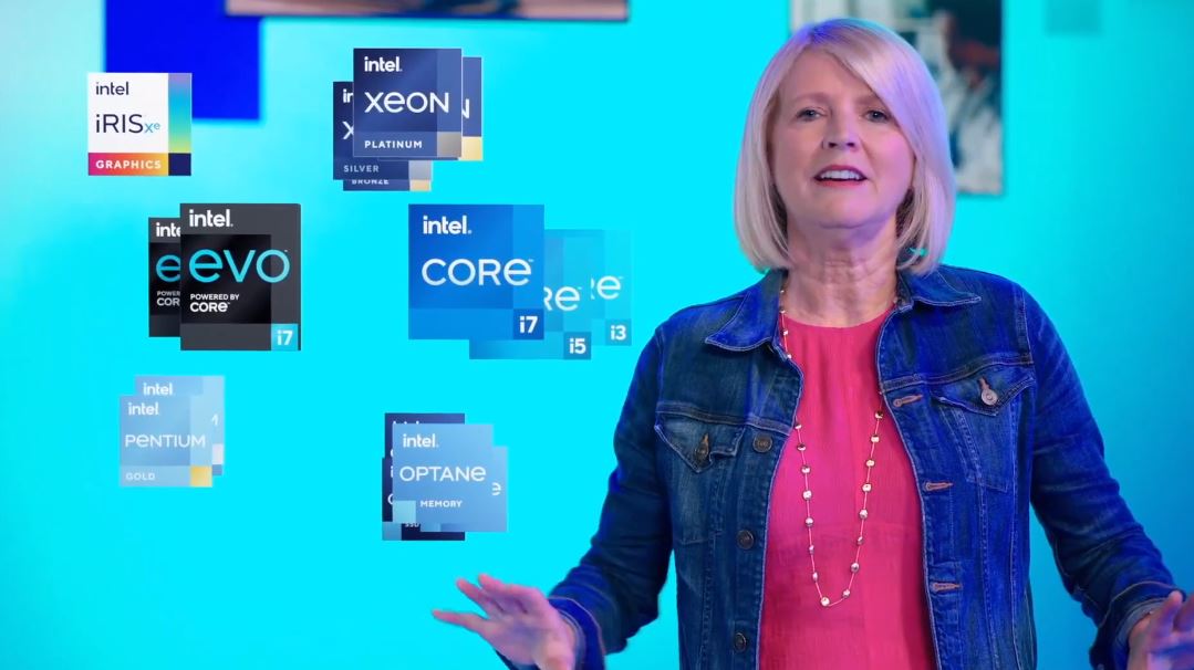
Beyond the consumer brands, we can see that Intel Optane, Optane Memory, Optane PMem, and other brands on the storage side are getting updated as part of the portfolio.
Intel Xeon has gone through a few transformations itself. For example, in the LGA1366 Xeon days, we had the 2nd Generation Intel Logo, Xeon, and some exposed silicon chip look in the top corner.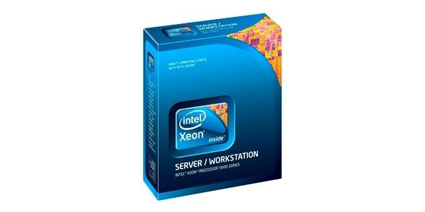
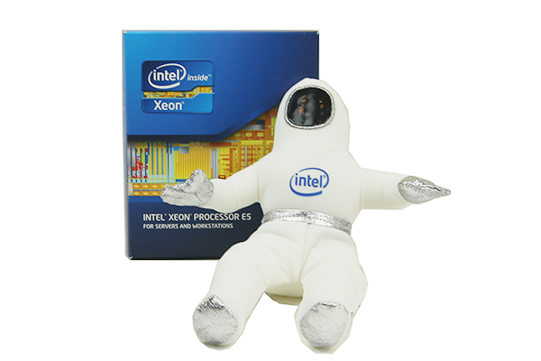
In the Intel Xeon E5 era, we had the partially exposed chip branding, and our photos of that era had a bunny suit figurine with the 2nd Generation Intel Logo as well.
As we moved to the Intel Xeon Scalable generation, the silicon look was removed and Intel focused on precious metals.
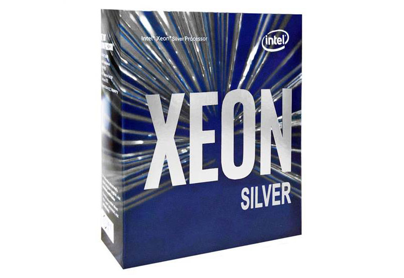
With the new look, we get Xeon Platinum now with a 3rd Generation Intel Logo branding box at the top with the color of the precious metal.
We expect to see this branding a lot more as we move into the Intel Ice Lake-SP Xeon generation later this year and next year.
Final Words
My first reaction is that this reminds me a lot of PwC’s rebranding almost a decade ago. As someone who did management consulting for years at PwC, my first thought is that I have made many PowerPoint presentations that shifting a small box location and color tint slightly more blue would make years of designing slides with this branding style relevant again. Perhaps that is the plan to recruit folks from PwC who already think and present in this brand style.
On the more serious tone, the new Intel Xeon branding, with the 3rd Generation Intel Logo looks great. We are excited for the upcoming second 3rd Gen Intel Xeon Scalable launch (Ice Lake Xeon edition) where this branding will be featured.


Could this new 3rd gen logo be why Intel common stock is up today (facepalm)?
Feel like the management rushed up the rebranding to soothe the investors that they are ‘doing something’ amidst their troubles. The new intel logo looses its identities and became nothing more than a typeface. And all these color palette and product marks simply borrowed the Win10 /flat design UI without putting any thoughts on it.
first thing that came to mind when i saw the blue dot over the i. Was it reminded me of IBM.
Whew, just in the nick of time. In my purchasing decisions, I just felt like something was missing and I couldn’t put my finger on it. Price? Performance? Features? Availability? Nope, nope, nope and nope. Finally, I can rest easy buying because of the new logo.
@Rich – you nailed it. Nicely done.
lipstick on a pig. it’s still a pig.
So this is Intel’s version of “This sticker adds 5 horsepower”?
Comments are closed.